Showing posts with label school. Show all posts

Wednesday, October 13, 2010

Meatless Mondays

I recently finished up a campaign assignment for school. The assignment was to think of an issue or cause important to you and create an ad/awareness campaign for it. I chose the topic of the extremely eco-unfriendly beef industry.

Yes, I am a vegetarian, however, this campaign wasn't about trying to get others to stop eating meat. My goal concepting this campaign was simply to raise awareness of the amount of damage the beef industry has on the world through land usage, water usage and gas production. And being that my target audience was meat eaters, I had to think of a way to get their attention. One path has been taken by PETA, the in-your-face "Meat is Murder" idea. I don't believe that is effective on anyone who doesn't already think that.

I was referred to a website called Meatless Monday which is a movement attempting to simply REDUCE the amount of meat eaten to better aid human health and the health of the planet overall. This is where my whole campaign took flight. I partnered up Meatless Monday and the North American Vegetarian Society (since I think most people won't even listen to what PETA has to say at this point) and created the following campaign:
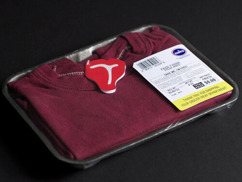

To best reach the demographic, a guerrilla campaign concept placing maroon "beef shirts" packaged similarly to products in the meat isle as a free give-away and attention getter.
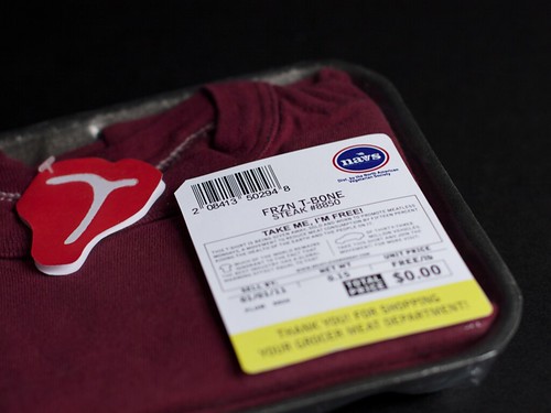

Faux label to further blend in with the meat products on top of clear saranwrap. Copy gives reader a explanation of Meatless Mondays and their mission as well as some brief facts on why the beef industry is harmful.


Detail of the T-Bone tag.
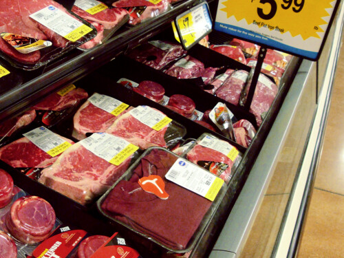

Shirt among the beef products. Can you spot it? Hahah (it's a bit of a Where's Waldo!) Thanks to my roommate for being my accomplice on this photo shoot mission to Kroger.
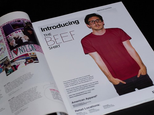

To reach parts of our demographic that eat meat but may not be shopping at the grocer or are younger, Meatless Monday teams up with American Apparel to produce limited time "Beef Shirts" sold at their retail locations. This is a print ad featuring "The Beef Shirt" to be run in magazines like Nylon and Print.
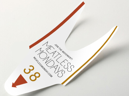

Deli isle pull for further demographic-contact. An item normally thrown away is now easily able to slip in the consumer's pocket so they may visit the website when they're home.


It's important when attempting to change behavioral patterns to give that person a helpful alternative. Here is a small book of meatless recipes that are all fairly easy to make. This book is available to order through MeatlessMonday.com for free and shipped through the mail.
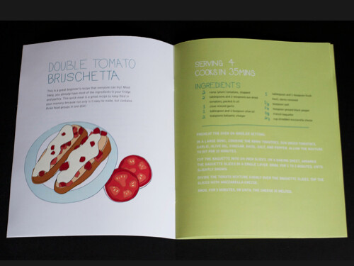

A simple layout, loose illustrations and hand-done typography keep Meatless Mondays friendly in the mind of the meat eater.
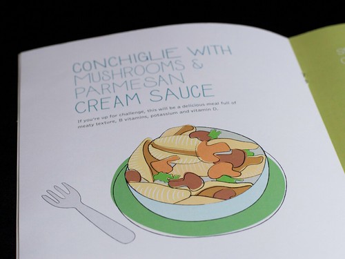


There were two other ads in this campaign that I will revisit during winter break. I think the booklet could use some work as well, color tweaks to relate a little better to the heavy maroon feeling of the beef shirt is something I'm considering. As always, I love feedback and critique!
Sunday, April 18, 2010

Hatch Show Print

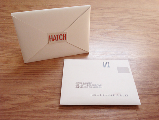
Here is my finished Hatch Project. More shots of mailer, the part of the project I worked on the most, on my website.


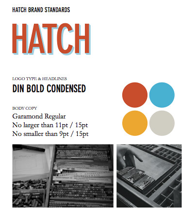
New [abbreviated] Brand Standards.


Direct Mailer Envelope.


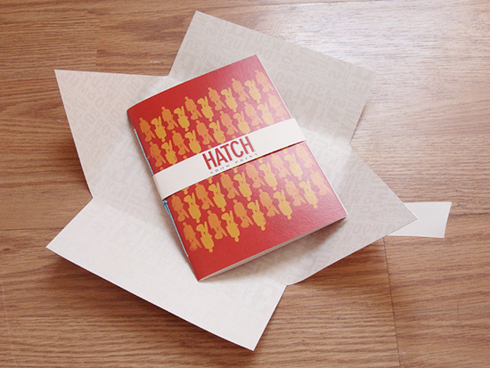
Direct Mailer Catalog.


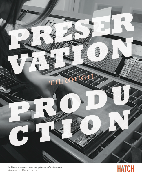
Print Ad for Print Magazine.


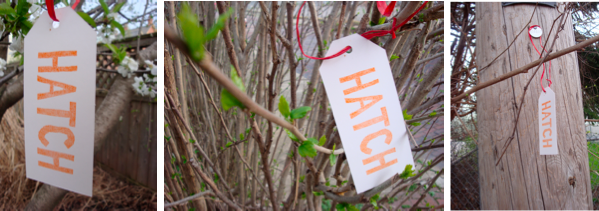
Guerrilla outdoor hang-tags with address, phone and website on back.

Sunday, March 7, 2010

Goof

I'm finding it hard to concentrate on what I should be lately. I've just been goofing off. Tomorrow will undoubtedly be a reality check as I start my new internship. Keep me in your thoughts, I'm terrified.

Tuesday, March 2, 2010

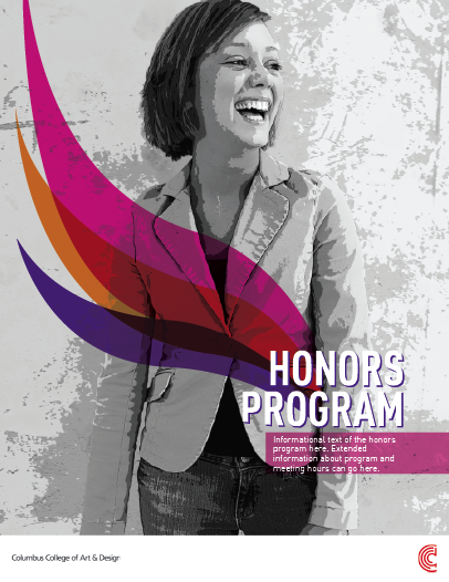
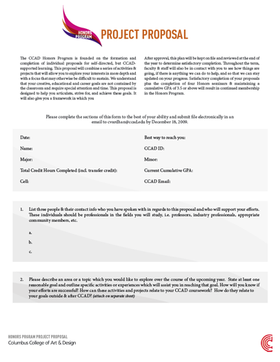
CCAD's Honor's Program Branding

Hi all, here's another post of my work from work. Myself and two other designers were asked to concept some ideas for CCAD's Honor's Program. Mine was the idea chosen and I thought I'd share some of it with you.


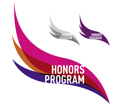
Logo with full color, b&w, and spot color application.


Poster application.


Form application.


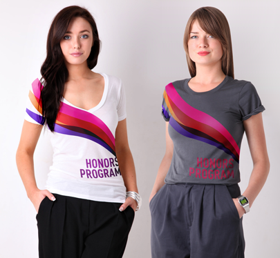
Tshirt design proposal.

So far it's been a pretty fun project to work on. I'm hoping the t-shirts end up just as I designed them but considering the cost it would be to create something that dynamic something tells me they're going to end up differently.

Critique and feedback is always welcomed and appreciated!

Monday, March 1, 2010

Work from Work

I'm going to start sharing some of the design work I do at my job. I'm not sure how much I'm actually allowed to show before it goes to press so I'll just post some unfinished works.

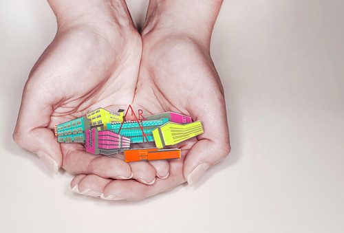
First up is a spread I'm doing for the CCAD Viewbook. The Viewbook is a publication sent out to prospective students to showcase what the school is all about. Pretty important piece. This spread is designed to convey the intimate atmosphere of CCAD. I took our campus buildings and drew them in illustrator, then printed them, cut them out and had our wonderful photographer take a shot of them.


Photo Credit: Pei-Yin Chen

I'll be posting more work throughout the week as well as my finished West Elm Catalog.

Wednesday, February 17, 2010

West Elm Catalog Project

I thought I'd take the opportunity to post my progress with this very long and drawn out project.

Assignment: Chose an office supplies carrier. Create a catalog to server their needs.

My take: West Elm furniture store. Focusing on office furniture and accessories.
Goal: Create a design guide for people who want the west elm look but need some hand holding.

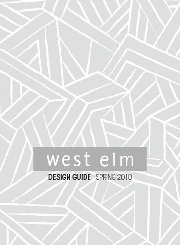
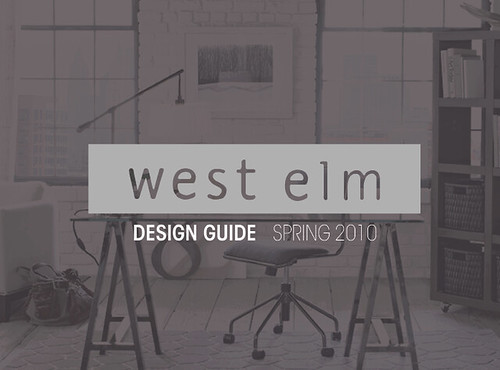
Here is my schematic, color pallete and two cover options.


Sunday, December 13, 2009

Two recent finals

Here are two of my last finals. I had one more huge final project but unfortunately I'm contractually unable to show it at this time. Keep your fingers crossed that something good comes out of that!

First up is my Ad/Graph sub brand final. The objective of the assignment was to image a sub brand camping company to any existing company and come up with branding, logo, launch ads and some sort of packaging for a chosen camping related product. My brand was designed to be a sub brand to Pottery Barn Kids and is titled Kakuee. A large part of my launch ad branding was the idea of children's imaginations and the ability young minds have to see a reality of their own anywhere. This project still needs tweaking but this is what was turned it. I feel so so about it.

The second project is one of two finals I was working on for my packaging design class. The assignment was to create a soap decide how much it would cost, what materials it would be made of, and how it would be packaged. I came up with one idea which my teacher thought "boring" so I went to a different idea and decided to finish my first idea up at a later time. Here is what I turned it. "Debutant Soap" for girls of any age. The soap is clear and in the mold of a diamond (which I painstakingly carved by hand). It's inset in a holster on the inside of the box. The exterior of the box is the abstracted cuts a diamond possesses. Simple geometric shapes will stand off the shelves against the cluster-fuck of all the other soap packaging.

Like I said, I'd like to be able to to show you my Web II final project that I've been coding for the past month but I probably won't be able to show that for a few months if one of my designs is chosen or up to a year and a half if it's not.

Thankfully, it's break and although I'll be working a little bit, I am going to have a lot of time to work on my own project. I hope to touch my computer very little over break other than to read my favorite blogs, tweet and check my email. Tyler and I will be painting the living and bed rooms today. Which is very exciting!!!

Wednesday, December 2, 2009

Coffee

...is the only thing keeping me alive at this point. We have entered the finals demension. Thank you Starbucks baristas for keeping me fueled with the triple grande mochas!


I'm working on finishing up some pretty cool projects in school and at work so please look back for those to be posted shortly!

Saturday, November 14, 2009

Junior Year Update

Here is some of the work I've been doing this year. I feel big changes going on this year.
Trends in Design, Ad Campaign for Anti-Steroid Abuse. Collaboration with Jordan Edwards.
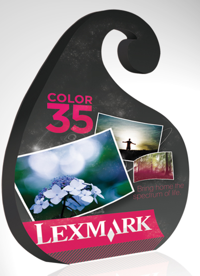
Packaging Design made with cut paper for Lexmark color ink.
Ad campaign for Suzuki. Collaboration with Emily Shirk.
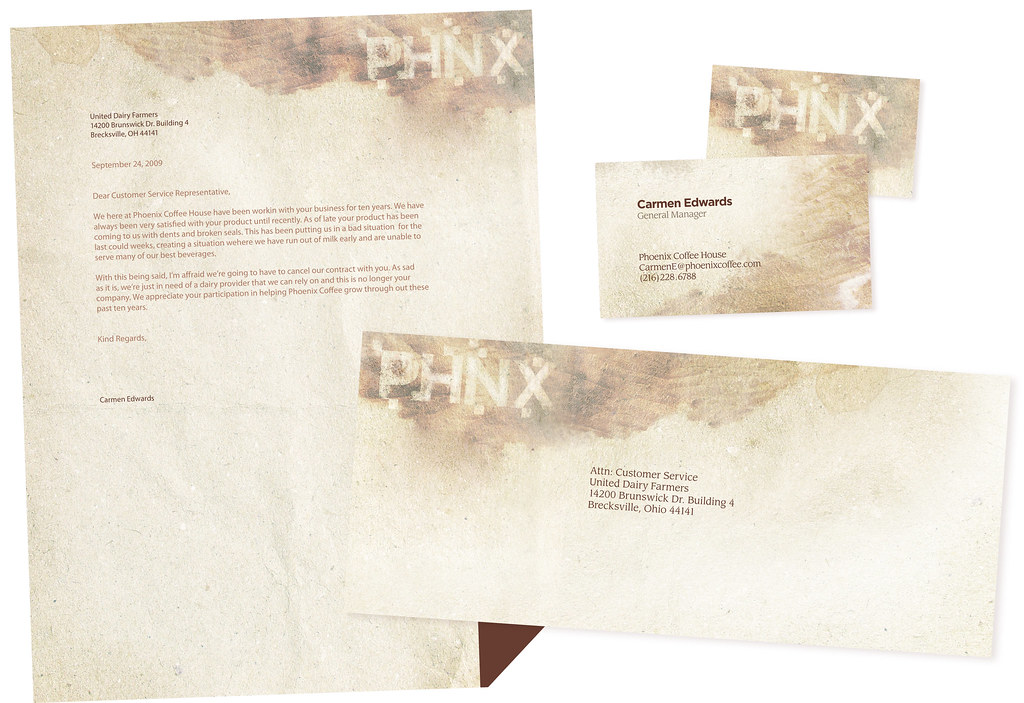
Identity re-branding for Phoenix Coffee in Northeast Ohio. Letterhead, Business Cards and Envelope design.
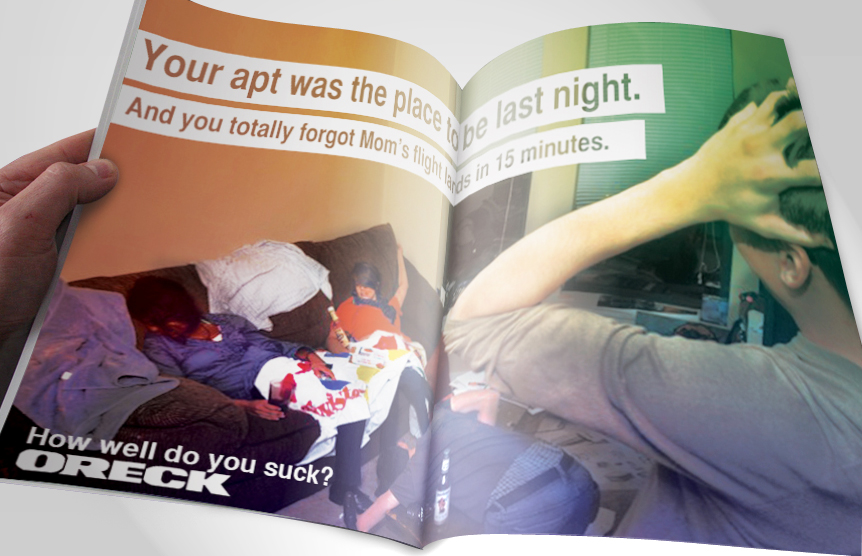
Ad campaign concept for Oreck Vacuums. Collaboration with Sami Nummi. Photo taken by Steven Vanscoy.
Not a school project but something I worked on in the summer/fall. The animal insider is a non-profit publication put out by the people at Animal Outreach. I was brought on to re-do the newsletter and give it a more magazine like appearance. Here is the PDF Issue.


That's all for now. Feedback welcomed and appreciated.

Wednesday, July 22, 2009

Saturday Morning Art Class

This is a poster design for my job at CCAD for what they call "SMAC" which is the Saturday Morning Art Classes. It's basically a program for kids grades 1-12 who can sign up for classes like Drawing, Painting, etc.

Monday, May 11, 2009

Self Portrait

Pretty excited about this piece because it was final for a class I've been forced to do realistic renderings and paintings for all year. Finally, we had no style restrictions on us and I could be as stylized as i wanted! All that was required was use of, pen and ink, waterbased paint media, typography, and collage. I used Watercolor, Micron Pens, News Paper and Graphite on this piece. Pretty satisfied.

Saturday, May 2, 2009

Jess' Bee Natural

This summary is not available. Please click here to view the post.

Monday, April 6, 2009

Forest Stewardship Council Done!

Finally done. Feedback is appreciated!

Friday, March 27, 2009

FSC Progress

Still going... One more. Kind of playing off the idea of forests just floating in little pieces of the world. Hah. Scary.

Monday, March 23, 2009

Spring Break Work

Thus far I've worked on finishing my Electronic Publishing Book, KenAy Kash's website and the FSC Ads. One ad pretty much done for that. Just gotta tighten things up. So. Much. Work.

Thursday, March 19, 2009

Word Play

The objective of my current assignment in Advanced Typography is to create a list, it could be about anything, and then illustrate it using only type. Here are my current sketches.

1) Mexico, United States, Texas
[Illustrating the immigration of mexicans to the united states via texas]

2) Cumulus, Status, Cirrus
[Illustrating cloud names by their position in the sky, body density, and colors.]


3) Benjamin, Franklin
[Very few people know that Benjamin Franklin invented the bifocal lens]


I'm sure my teacher will hate them all, because I like them and we disagree on most things. We shall see.

Sunday, March 1, 2009

March!!!

About one second ago I realized that it is now March. Where has all the time gone? It's so crazy. Although when it feels like time is going quickly, when I think about it in terms of projects I've completed at school, I realize I haven't been back at it that long.

Illustration Methods isn't going as well as I had hoped it would be. But the next project should be great. The assignment is to pick a demographic and come up with your own line of desk supplies. I'm heading somewhere between adult and young adult. My theme is retro designs with modern colors made with Eco Friendly materials, like FSC certified woods and natural fibers. I'm going to call the line, Sundance Supplies. Should be fun. We're just working on preliminary sketches now.

Other classes have been going well I suppose. My Team Ad and Graph class is working on an assignment to advertise for "Tools". Now my team wasn't my first pick in the beginning but it's really ended up working out for us. We chose to represent Utrecht Art Supplies. I've kind of been labeled the art director of the group which is fine because I'm the only serious Ad Graph Major in the group. I've been in charge of the Logo and Packaging mostly.
Presentation for that project is in a couple weeks. Hopefully it goes weel.

One assignment I've wrapped up recently is my Ad and Graph two page spread assignment. We had to chose and article that did not come with any photos or illustrations and chose a magazine to lay it out in. I chose an article related to the Mayan prediction of 2012 and this is what I came up with.
The illustrations are done in Micron Pen and then later I scanned them in and colored them in Illustrator.

I'd appreciate any and all criticisms of these works.
I'll check in soon again. PROMISE!

Monday, February 16, 2009

Second Semester

I've been working really hard this semester to build up a great portfolio and make this year even better than last. I feel like I finally know the direction I want to go in terms of my graphic style. I realized over break, I lean more towards a modern and handwritten style of design. Finding this direction to take has definately helped me get project concepts down faster.

My most important projects in the works are, rebranding Utrecht for my Ad Team class, Two Page spread for a National Geographic article on the Mayan Calendar, Type Matters book for my Electronic Publishing Techniques class, and well unfortunately my WebDesign class is a drag and Advanced Typography takes up all my time.

I'm sure I'll be updating with some of my own work soon but for now I'll leave you with some of my favorite inspirations I've saved as of late:
Floating Island from A Print A Day


From: Freshly Blended

From Oatmeal and Cinnamon

Enjoy! More updates soon!